


How to Worry About House Prices

Decades from now, scholars will still be debating the causes of the Great Recession of the mid-2000s, but it’s generally agreed that the collapse of the housing sector was at or near the eye of the hurricane. House prices fell around 25 percent between 2006 and 2011 erasing $6.2 trillion in housing wealth. As a result, almost 23 percent of borrowers found themselves underwater, owing more on their mortgages than their houses were worth. Delinquencies and defaults skyrocketed. Almost two million borrowers lost their homes to foreclosure and short sale. The homeownership rate in the U.S. dropped from 69 percent in 2006 to less than 64 percent today.
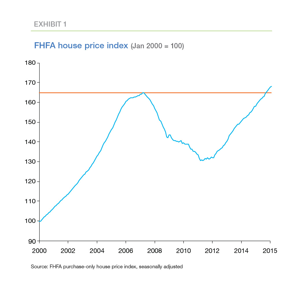
While the Great Recession ended in the middle of 2009, house prices nationally didn’t begin recovering until 2011. Recently, prices finally topped their 2006 peaks (Exhibit 1). House price growth has been particularly strong in recent years, averaging 5.6 percent annually.
For the first few years, rapid house price appreciation was welcome news. Homeowners regained lost equity, the number of underwater borrowers shrank and delinquencies and defaults fell. More recently though, surging house prices have led some to worry about the potential for another house price bubble.
The magnitude of the destruction wrought by the Great Recession provides plenty of justification for caution about rapidly rising house prices. However, the Great Recession also provides evidence that even experts have difficulty recognizing a house price bubble.1 Part of the difficulty can be traced to the multitude of house price models and metrics used by housing analysts. As we’ve shown previously2, these indicators often provide confusing and contradictory signals.
How can we tell when we should be worried about rising house prices? There is no foolproof technique, but there are methods that provide useful guidance. The rest of this article explains a two-stage method for identifying unsustainably-high house prices. The first stage of this method compares the prices of recent sales to household incomes to pinpoint areas that merit further scrutiny. As it turns out, these areas are not always the ones you see in the house price headlines. The second stage checks whether additional indicators suggest that house prices in the highlighted areas are headed for a fall in the future. So far, these indicators suggest that it’s not time to worry about house prices—yet.
First stage: Pinpointing high house prices
How can we tell if house prices are high, at least high enough to merit further scrutiny? Sometimes it’s easy. Up until last year, the oil price boom and the rapid expansion of innovative drilling techniques generated outsized house price increases in some areas of the oil patch. More recently, the collapse in oil prices suggests those previous house price increases are likely to be reversed shortly. In some areas, evidence of borrower distress already has surfaced. For cases like these—that is, situations with geographically-specific economic shocks—no model is needed to identify heightened house price risk.
What we’re looking for is a way to spot areas where house price increases appear to be feeding on themselves for no apparent economic reason—in other words, the beginning of a bubble. One of the challenges in spotting bubbles is the sheer number of local housing markets to review. There are 374 MSAs in the United States, and important sub-markets in many of these MSAs. A granular analysis of housing conditions in every one of these markets would be more likely to confuse us than to enlighten us. We need a simple, intuitive metric to “thin the herd”, to cut the list of housing markets to a manageable group of potential hot spots that merit more detailed scrutiny.
Several different metrics of this type appear frequently in the press. Examples include:
- Affordability metrics. A typical affordability metric calculates the maximum house price an “average” family could afford given current mortgage rates and assuming they take out a 30-year fixed rate mortgage with a 20 percent down payment. These metrics are highly-sensitive to swings in mortgage rates, making them less useful for assessing the long-term sustainability of current house prices.
- Mortgage payment compared to rent. These metrics provide an indication of the cost advantage or disadvantage of renting versus owning a house.3 As with the affordability metrics, the mortgage payment calculation is sensitive to short-run swings in mortgage rates. In addition, the measures do not take into account the ability of current renters to qualify for a mortgage and to acquire a down payment. More important for our purposes, rents and house prices may experience a bubble simultaneously.
- House price compared to income. This measure divides the median price of recently-sold homes by median household income. Unusually-high values of this ratio may indicate that current house prices are claiming an unsustainably-large share of household budgets. High values also may indicate that home buyers expect house prices to continue to increase rapidly—a characteristic of housing bubbles.
Each of these metrics has its uses, and none of them are without weaknesses. Nonetheless, the house price-to-income (PTI) ratio appears to be the clearest indicator of the long-run sustainability of house prices. Accordingly, we use the PTI ratio to trim the list of U.S. housing markets down to a tractable watch list.
Where are the high PTI ratios?
Exhibit 2 displays the price-to-income ratio for the U.S. as a whole from 1993 through 2015. Median sales prices peaked at 4.8 times median household income in 2005 as the housing bubble was poised to burst. When house prices collapsed during the crisis, the PTI ratio plummeted to a low of 3.2 in 2011. Since then, the ratio has recovered and currently stands at 4.0.
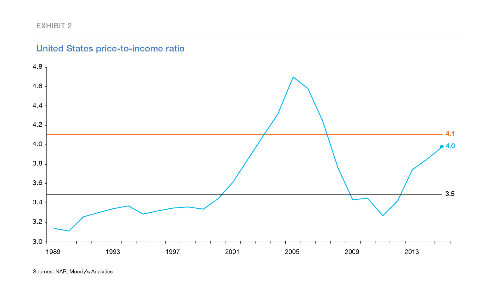
Two reference lines appear on Exhibit 2. The lower line is drawn at 3.5, the median of the PTI ratio between 1993 and 2003, prior to the house price bubble and subsequent crisis. Many analysts regard 3.5 as a “normal” value of the PTI ratio for the U.S.
The upper line, drawn at 4.1, separates “usual” from “unusual” values of the PTI ratio based on both the level and volatility of the ratio from 1993 to 2003. Based on a standard statistical criterion4, ratios above the 4.1 threshold are outliers. This threshold clearly highlights the unsustainably-high house prices recorded around the peak of the house price bubble. As shown in Exhibit 2, the national PTI ratio is not yet an outlier. However, the ratio is above its long-term median value of 3.5; it has been trending up since 2011; and it currently lies just below the 4.1 outlier threshold.
Thinking About Affordability
Freddie Mac’s Multi-Indicator Market Index (MiMi) contains a payment-to-income indicator that analyzes the sustainability of house prices from an affordability perspective. Benchmarked to December 1999, it measures payments on 30-year fixed-rate mortgages relative to homebuyers’ income captured by area median household income.There are two important differences between the MiMi payment-to-income indicator and the PTI ratio.
- First, MiMi uses a repeat sales index (Freddie Mac House Price Index) to measure house prices rather than median transaction prices. In general, the repeat sales index and median transaction price will follow the same trend, though median transaction prices sometimes move due to composition effects—e.g. more large homes for sale in a given month—rather than trends in underlying home values.
- MiMi uses an affordability metric, payment-to-income, rather than price-to-income. The payment-to-income indicator will be sensitive to interest rate movements, while the price-to-income metric will be only indirectly impacted by interest rate movements.
Payment-to-income or price-to-income metrics provide alternative views into the sustainability of house prices. If interest rates decline permanently, then standard user-cost theory suggests that house prices will be permanently higher supporting a higher price-to-income ratio with little to no change in the mortgage payment-to-income ratio. This suggests that a payment-to-income indicator would be more appropriate for determining the sustainable level of house prices*. However, mortgage interest rates can be highly volatile implying a payment-to-income indicator may underestimate house price risk. User-cost theory also implies that rising interest rates would require falling house prices to sustain the same payment-to-income ratio. Using a price-to-income indicator gives a more conservative estimate of the sustainability of house prices particularly when benchmarked to an era of significantly higher mortgage interest rates.
*A payment-to-rent indicator would be even better, but finding high quality timely market rent data at the local level is far too difficult. See: “Rents Rise 10%. And 12%. Also 8%”. Bloomberg.
At this stage, it is worth restating that the PTI metric serves as a rough but useful way of spotting housing markets that merit closer scrutiny. By itself, an unusually-high PTI ratio doesn’t indicate that current house prices are unsustainably-high and due to fall. A house price bubble is essentially a financial phenomenon.5 But there may be nonfinancial factors that explain a high PTI ratio. For instance, house prices may be supported by the growth of a geographically-specific industry. Recent examples are the software industry in Silicon Valley and, until recently, the oil industry in the oil patch states. In those “boom-town” situations, job seekers arrive faster than the supply of housing can increase, and house prices are driven higher. As a result, an unusually-high PTI ratio does not, by itself, prove that house prices are too high. At best, it indicates a need for further analysis.
“Normal” price-to-income ratios vary a lot across the country. In some metros, PTI ratios typically are much higher than they are in the U.S. as a whole. For example, San Francisco is a desirable location, and residents historically have been willing to devote a larger-than-average share of their budgets in order to live there. In addition, buildable land in San Francisco is extremely limited, so the supply of housing can’t expand to meet the high demand. Both factors help explain the high PTI ratio in San Francisco.
The outlier threshold in a particular market depends both on the typical PTI ratio in that market and on its volatility. In very volatile markets, PTI ratios often drift significantly higher than the average. Thus, in those markets, the PTI ratio must stray even further from the average to stand out as an outlier.
As it happens, the price-to-income ratio in San Francisco also is much more volatile than the national average. This high volatility means that very-high PTI ratios in San Francisco are not outliers, at least according to our statistical formula. And, in fact, San Francisco is not currently on our watch list, even though it has one of the highest PTI ratios among the 50 largest metros in the US.
Exhibit 3 displays 10 metros with unusually-high PTI ratios as of the end of 2015.6 Interestingly, they appear in clusters—Raleigh and Charlotte in North Carolina; Jacksonville, Orlando, and Miami in Florida; Dallas, Austin, and San Antonio in Texas; and Portland and San Jose on the West Coast.
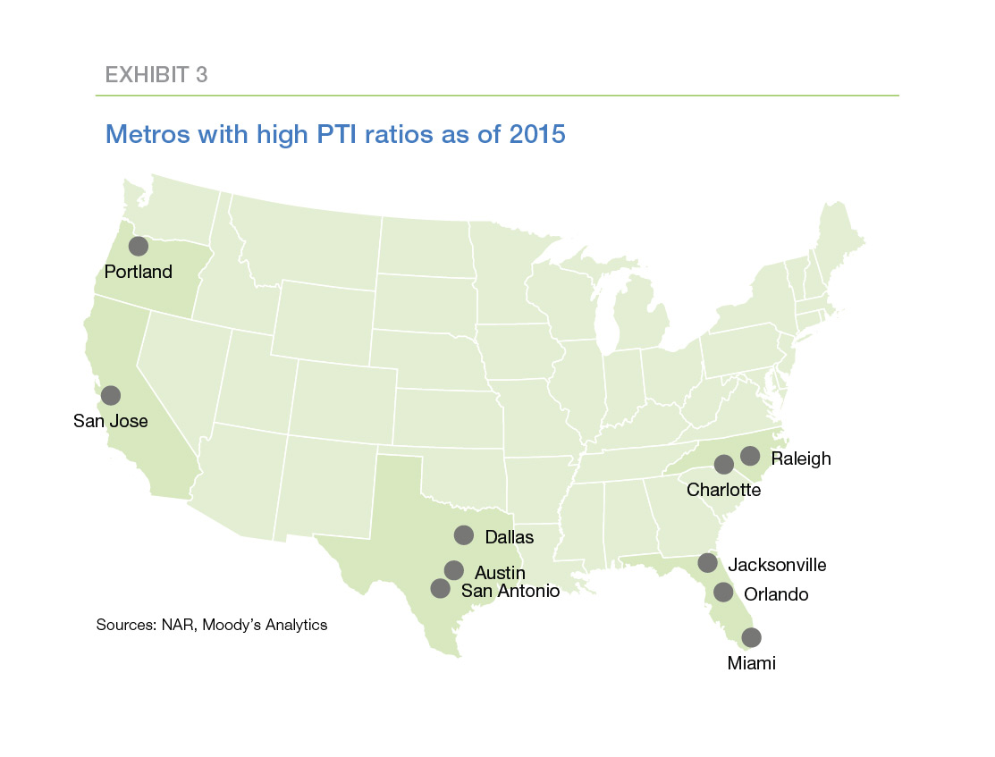
Sources: NAR, Moody’s Analytics
The PTI ratios in these 10 metros are high relative to the historical experience in each metro. For instance, the current PTI ratio in San Jose is 9.6—that is, the median price of recent home sales in San Jose is 9.6 times the median household income in San Jose. But that PTI ratio is only modestly higher than San Jose’s outlier threshold of 9.4. The San Jose metro includes much of Silicon Valley, and the relatively-high volatility of house prices in San Jose reflects the relatively-high historical volatility of the tech sector. In contrast, the current PTI ratio in the Dallas metro is 3.4, lower than the national median value of 3.5. However, PTI ratios in Dallas historically have been both low and relatively stable. The outlier threshold for Dallas is only 3.2.
Do high price-to-income ratios signal a house price collapse?
The PTI ratio doesn’t, by itself, identify potential house price bubbles. Other supporting information is needed. In particular, the answers to three questions are needed:
- Are there nonfinancial reasons for the high PTI ratios? For example, can we point to rapid growth in a geographically-specific industry that explains the current PTI ratio? If yes, high house prices may be sustainable in this area. If not, it’s possible that high house prices may represent a financial bubble.
- Are credit conditions deteriorating?Are delinquencies and defaults increasing? Is unemployment on the rise? If so, house prices may come under pressure.
- Is leverage increasing? Are home owners using the equity in their homes to finance high levels of consumption? If so, home owners may not have a large enough financial cushion to weather future slowdowns in the economy.
The answers to these questions provide strong evidence for or against a house price bubble, but they are not definitive. It’s just not possible to mathematically prove the existence or absence of a house price bubble. As with many key questions in economics, something like a legal standard of proof—the preponderance of the evidence—may be the best we can do. In any event, the answers to these three questions can go a long way toward determining the level of house price risk.
Let’s consider each of them in turn.
Are there nonfinancial reasons for the high price-to-income ratios?
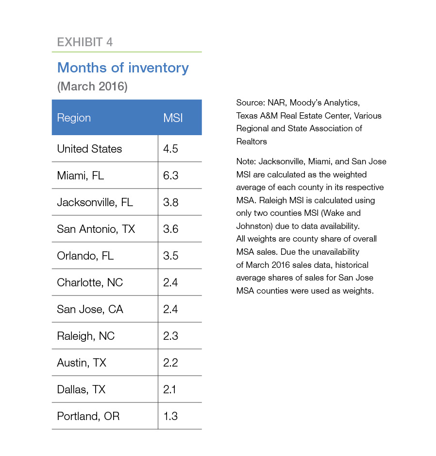
A key characteristic of housing markets currently is the limited supply of houses for sale. A rule of thumb for a balanced market is an inventory of homes for sale sufficient to cover six months of sales at the current pace of sales. Nine of the ten metros on our “watch list” have less than six months of inventory currently (Exhibit 4). Three metros have between three and four months of inventory, four have between two and three months, and Portland has just over one month of inventory. Only Miami appears to have a balance between supply and demand at present.
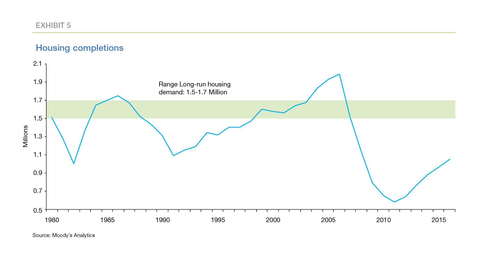
The low rate of new home completions suggests the shortage of inventory may persist for several years (Exhibit 5). A completion rate of 1.5 million to 1.7 million houses per year roughly covers the rate of household growth and the rate at which older homes become uninhabitable. Since the onset of the housing crisis, the completion rate has fallen far below this range. The completion rate has been increasing since the trough of 0.5 million units in 2011, but most forecasters believe it will take two to three years before the completion rate reaches the 1.5-million-to-1.7-million-unit rate.
The increase in recent years in income inequality provides another reason increasing PTI ratios may not be signaling increasing house price risk. PTI ratios compare the median price of recently-sold homes to the median household income, including households that intend to remain renters and home owners with no plans to move. The upward trend of traditional PTI ratios may indicate simply that more-affluent households are purchasing higher-end houses. Affordability may be decreasing for average- and lower-income households, but the households that are purchasing homes may not be stretching financially to do so.
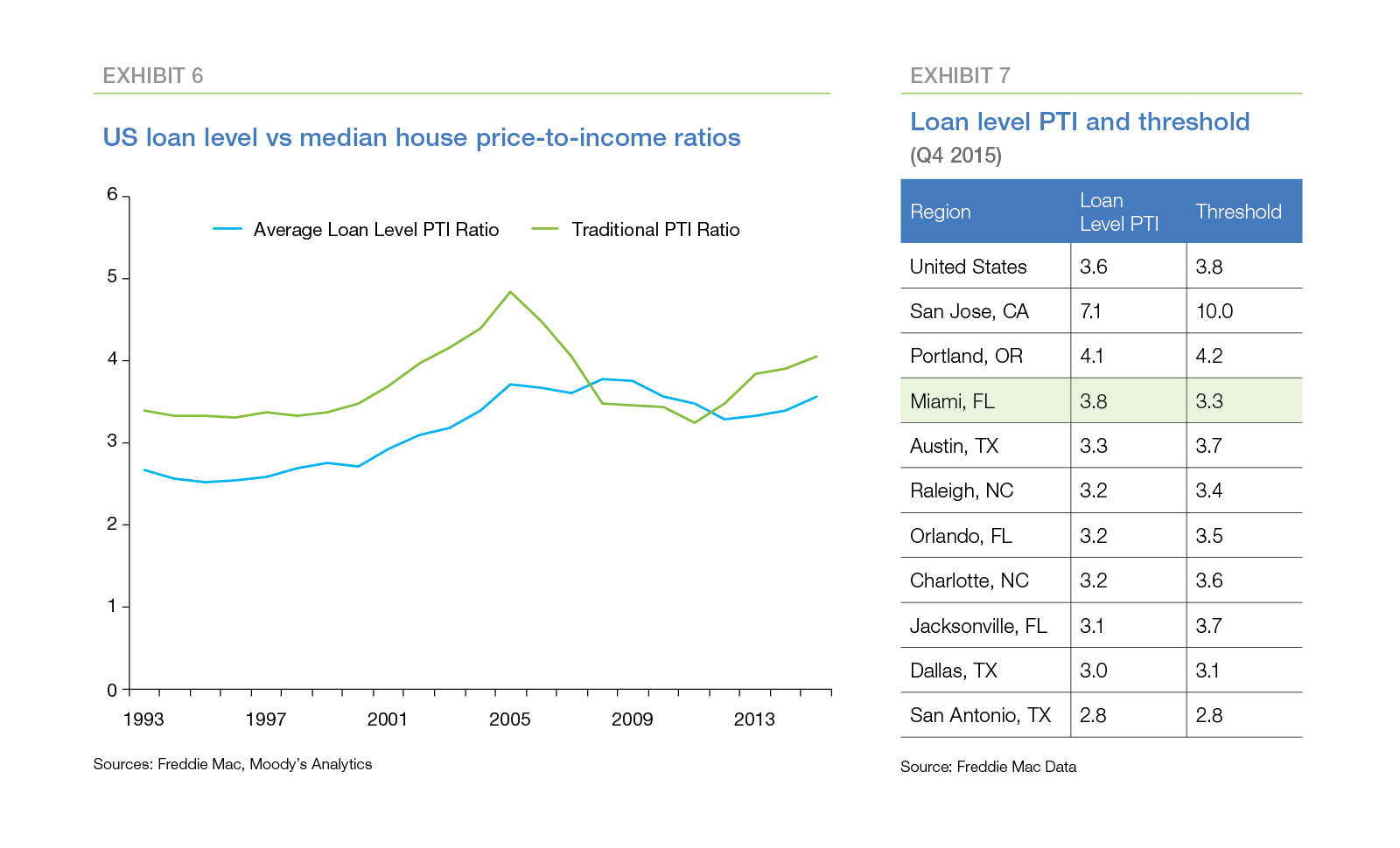
A review of loan-level Freddie Mac data provides mixed evidence on this hypothesis (Exhibit 6). The average of loan-level PTI ratios—the ratios of the house price to the income of the buyer of that specific house—is lower and less volatile than the traditional PTI measure. The loan-level PTI ratio for the U.S. is 3.6, while the recalculated outlier threshold is 3.8. Moreover, nine of the ten metros on the watch list no longer exceed their recalculated thresholds. Only Miami still exceeds the outlier threshold (current ratio 3.8 compared to recalculated threshold 3.3).
However, note that even the loan-level ratio has increased noticeably in recent years, and the trend presents an intriguing pattern.8 Prior to 2001, the national loan-level ratio was relatively flat and averaged about 2.6. From 2001 to 2008, the ratio increased steadily to roughly 3.8. Since then, the ratio has oscillated around this higher level. This pattern suggests that, in the post-crisis housing market in the U.S., borrowers are devoting a higher-share of income to housing, on average, than they did historically.
Are credit conditions deteriorating?
Deteriorating credit conditions suggest higher defaults and foreclosures in the future, which, in turn, may put downward pressure on house prices. However, outside of a few areas impacted by the oil price bust, there are no indications of credit problems on the horizon.
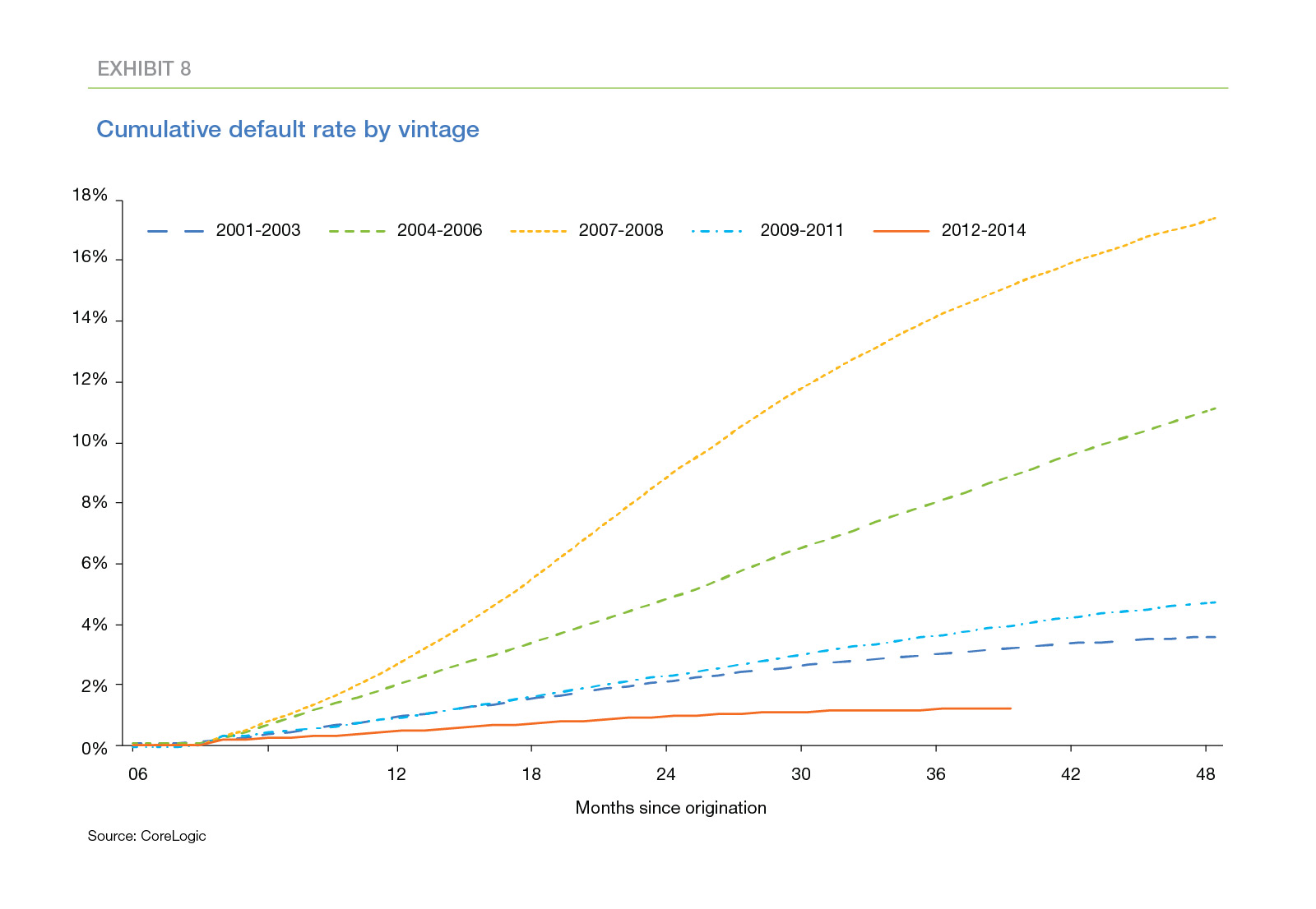
Following the onset of the housing crisis, lenders tightened underwriting standards significantly. Borrowers with less-than-stellar credit scores found it difficult to obtain loans, and even the most creditworthy borrowers faced additional scrutiny and paperwork in the mortgage approval process. Riskier types of mortgages—negative amortization loans, interest-only loans, high-LTV loans—either disappeared or were severely curtailed. As a consequence, the credit performance of mortgages originated in recent years has been very good (Exhibit 8).
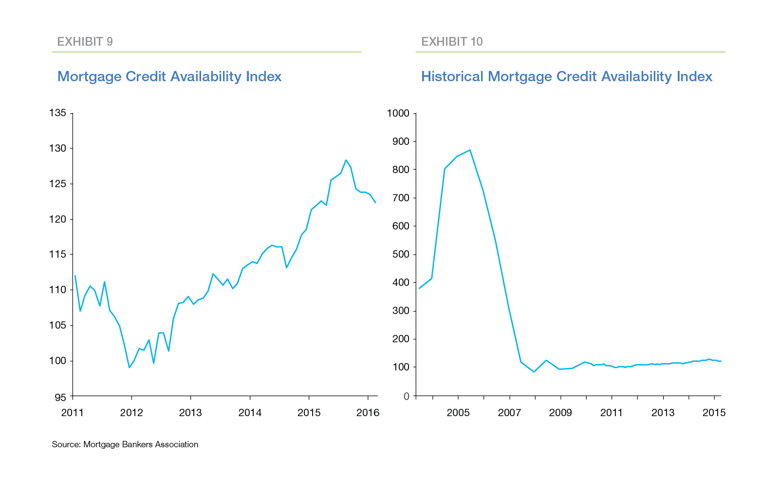
As Exhibit 8 highlights, delinquency and default reveal themselves only over time. Other measures may provide more-timely indications of weakening credit conditions. The Mortgage Bankers Association (MBA) publishes an index of credit availability.9 This index has been increasing steadily since 2011 (Exhibit 9) suggesting underwriting standards may be loosening. However, this increase does not appear significant when compared to the levels the index reached during the house price bubble (Exhibit 10).
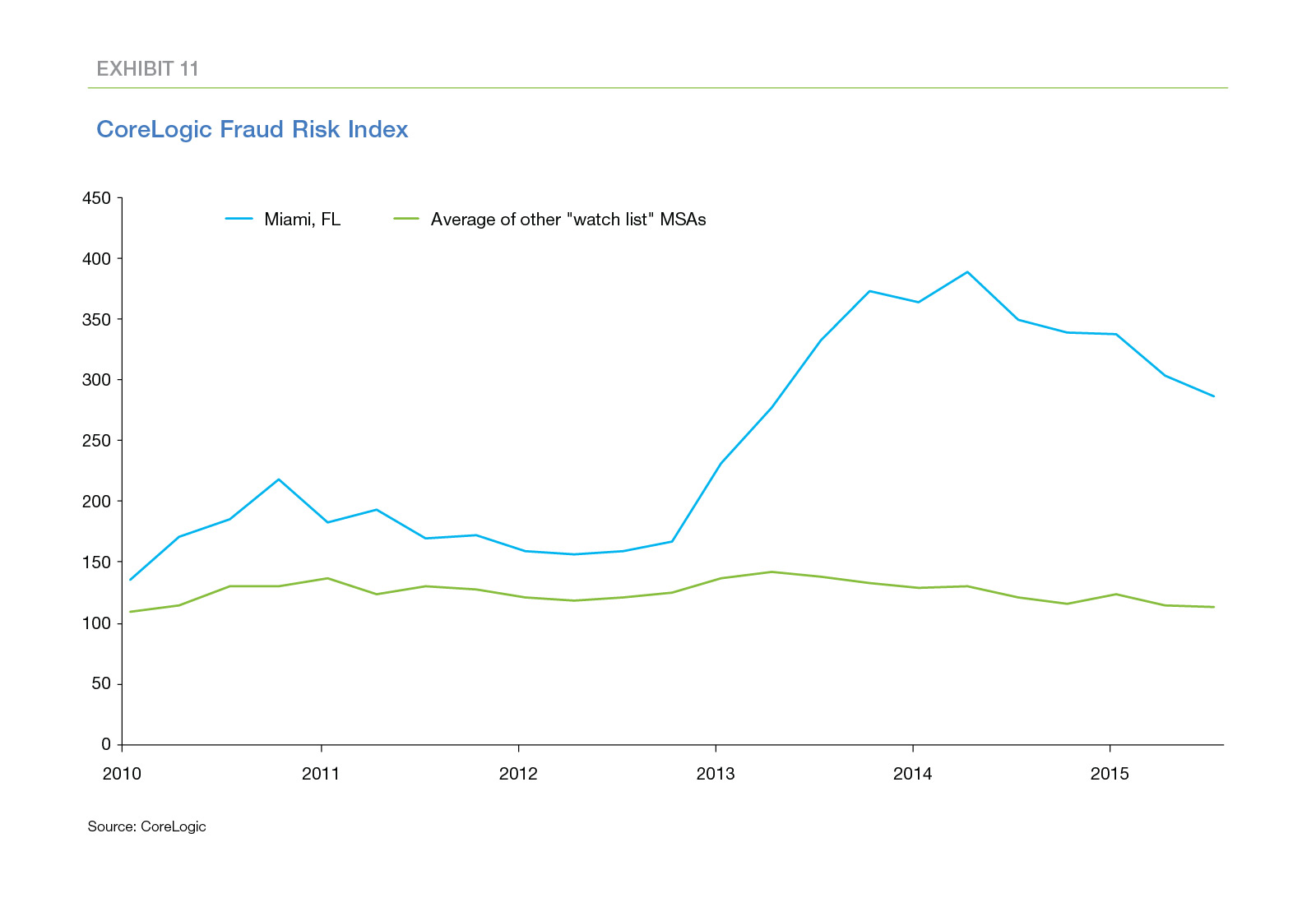
Increases in mortgage fraud may signal lax underwriting. CoreLogic publishes a mortgage fraud risk index that is based on metrics known to be correlated with mortgage fraud.10 Exhibit 11 compares the CoreLogic index of mortgage fraud risk for Miami, the one metro with an unusually-high loan-level PTI ratio, to the average index for the other nine metros on the watch list. The index for Miami has increased sharply in the last few years, but no such trend is visible for the average of the other nine metros.11
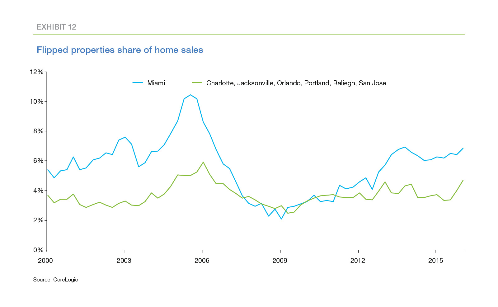
Increases in house flipping—house purchases by investors who rehab and resell the houses quickly—may also indicate overly-optimistic investor expectations of future house price appreciation. Exhibit 12 displays the CoreLogic estimate of the share of flips in home sales in the Miami area.12 Currently, flipping represents just over six percent of home sales—well below the peak of around 10 percent during the housing boom. However the share of house flipping in Miami has been steadily creeping up since 2008.13
Taken as a whole, these metrics identify isolated areas where credit conditions may be starting to weaken, however there is no evidence of a general deterioration in credit conditions at present.
Is leverage increasing?
High leverage makes borrowers more vulnerable to house price volatility. In addition, high leverage increases the losses suffered by lenders and mortgage insurers when borrowers default. In the housing boom years, many borrowers supported increases in consumption by extracting the equity in their homes.14 As a result, evidence of increasing leverage is an important warning signal of potential house price weakness.
Exhibit 13 displays the value of the U.S. housing stock from 1990 through 2015. The blue-shaded area at bottom measures the value of outstanding mortgage debt. The remainder—the green-shaded area above—represents home owners’ equity. The value of housing increased rapidly in the early 2000s. Mortgage debt also increased rapidly during this period as home owners used cash-out refinances and HELOCs to monetize the equity in their homes. The value of housing also has increased rapidly since 2011. However, mortgage debt outstanding has not increased over this period; in fact, it has declined slightly. Although home owners currently have a near-record amount of equity in their homes, they have not tapped it so far.
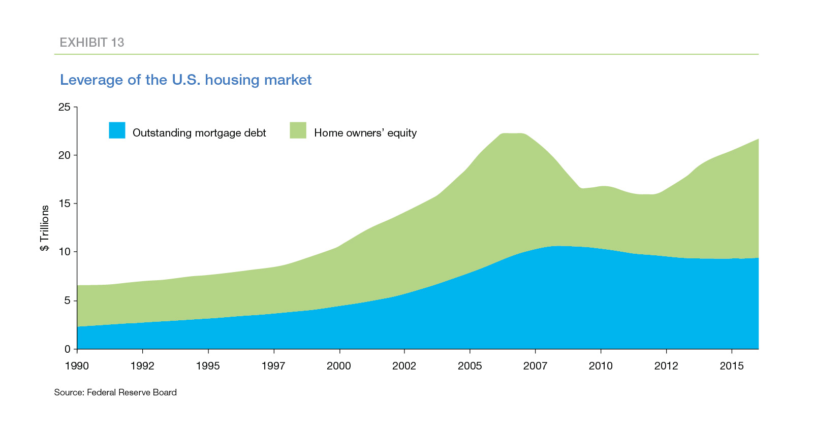
As things stand currently, the high level of equity provides home owners with a substantial cushion against house price fluctuations. A short-term downturn in housing is unlikely to trigger a larger crisis, since there will be only a small increase in the number of underwater borrowers. Home owners who face unexpected life events, like job loss or serious illness, and are unable to pay their mortgages generally will be able to sell their homes for more than the outstanding balances of their mortgages. The contagion effects that plagued the economy during the housing crisis are unlikely to recur.
Of course, home owners may decide in the future to increase their leverage, especially if the pace of wage growth fails to accelerate and the income of the majority of Americans continues to stagnate. In that situation, households will be less resilient in the event the economy sags, and house price risk will increase.
Conclusion
House prices have breached the peak levels of 2006, raising concerns about the long-term sustainability of current price levels. The difficulty of forecasting house price appreciation and the conflicting signals of the multitude of house price metrics make it challenging to assess whether—and where—house price risk is indeed increasing.
The approach described above provides an organized method for assessing house price risk. This method is not a crystal ball that predicts the path of future prices. Instead the approach describes a two-stage method for identifying areas where worry may be justified. The first stage uses the ratio of house prices to household income to “thin the herd”, that is, to screen out the majority of areas that are unlikely to pose near-term risk. For the remaining areas, the second stage assembles supporting information that can either confirm reasons for concern or, alternatively, muster evidence that a collapse in house prices is unlikely.
Our first stage identified ten large metro areas with unusually-high house prices relative to the household incomes in those areas. However, the second stage failed to produce compelling evidence of increasing house price risk.
- Tight inventories of homes for sale are boosting house prices and are likely to continue supporting high house prices for several years. In addition, increases in income inequality may be exaggerating the true price-to-income ratios.
- The credit quality of originations in recent years remains high, and the performance of these originations is much better than that of loans originated during the housing boom of the early-to-mid 2000s.
- At present, home owners have not increased their leverage despite the rapid increase in the equity in their homes.
This last point highlights what is likely to be the “canary in the coal mine.” As long as leverage remains low, home owners will remain resilient in the face of economic fluctuations. However, if leverage creeps up, home owners’ financial cushion will shrink, leaving them more vulnerable to economic shocks.
In sum, this analysis suggests that, aside from isolated areas, we don’t need to worry about house prices—yet.
PREPARED BY THE ECONOMIC & HOUSING RESEARCH GROUP
Sean Becketti, Chief Economist
Elias Yannopoulous, Quantitative Analyst
Brock Lacy, Quantitative Analyst
1 Reference to “In Closing: What Were They Thinking” in the September. 2015 issue of the Insight & Outlook
2 Reference to “Insight: Are House Prices Too High in Your Neighborhood?” in the August 2015 issue of the Insight & Outlook
3 Freddie Mac’s My Home® web site [LINK: myhome.freddiemac.com] provides a wide variety of information for potential home buyers including a rent-vs-buy calculator. [LINK: http://calculators.freddiemac.com/response/of-freddiemac/call/home10]
4 Reference and formula for outside values
5 In economic history texts, bubbles often are described as financial “manias”, emphasizing the lack of fundamental economic reasons for the rapid price increases.
6 For this article, we limit our focus to the 50 largest MSAs. Some smaller markets also have unusually-high PTI ratios.
7 Pent-up demand for houses will continue to grow during the period when the pace of housing completions is recovering, exacerbating the imbalance between demand and supply and perhaps extending the period during which tight inventories boost price-to-income ratios. An increase in the supply of existing homes for sale could mitigate the demand/supply imbalance, but current evidence does not indicate any imminent net increase in the number of existing homes for sale.
8 GSE underwriting standards limit the allowable debt-to-income ratio, thus these data may not accurately capture the relationship that obtains in the broader market. Loan-level data on non-GSE loans may shed more light on this hypothesis.
9 https://www.mba.org/2016-press-releases/may/mortgage-credit-availability-decreases-in-april
10 http://www.corelogic.com/about-us/researchtrends/mortgage-fraud-trends-report.aspx#.V0SszL-AZ_E
11 Looked at individually, the indices for Orlando and Jacksonville also have trended up in recent years but not as sharply as Miami.
12 A flipped property is one that is bought and sold within nine months.
13 Among the ten metros on our watch list, Miami, Orlando, and Jacksonville currently have the highest shares of flipped properties.
14 Texas has a law restricting the amount of equity that can be extracted by HELOCS. Recent research suggests this law may have insulated Texas from some of the impact of the housing crisis.