Economic and Housing Research
Original research and analysis on housing trends, the economy and the mortgage market
Economic, Housing and Mortgage Market Outlook – January 2025
The U.S. economy grew at a stronger pace than initially estimated in the third quarter of 2024 while the labor market remains resilient.
Read MoreEconomic, Housing and Mortgage Market Outlook – January 2025
-
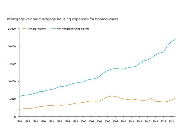
Spotlight | December 20, 2024
Homeowner vs. Renter Spending in an Era of Rising Housing Costs
Homeowners locked into low mortgage rates have shielded themselves from rising interest rates and house prices, whereas renters do not have the same advantage. More
-
Outlook | December 20, 2024
Economic, Housing and Mortgage Market Outlook – December 2024
The U.S. economy remains robust with strong Q3 growth driven by consumer spending. More
-
Spotlight | November 26, 2024
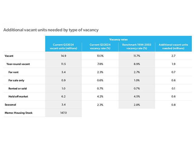
Housing Supply: Still Undersupplied by Millions of Units
The housing market continues to be plagued by a shortage of units for rent and for sale. We estimate the housing shortage is 3.7 million units as of 3Q24. More
-
Outlook | November 26, 2024
Economic, Housing and Mortgage Market Outlook – November 2024
The U.S. economy remains resilient with strong Q3 growth even as the labor market moderates. More
-
Research Note | November 12, 2024
The Decline in Relative Housing Affordability and the Impact on Homebuyer Search Behavior
In this analysis, we use actual, detailed transaction data on rents, home prices, and mortgage payments for individual homes and borrowers to produce a new relative affordability measure. More
-
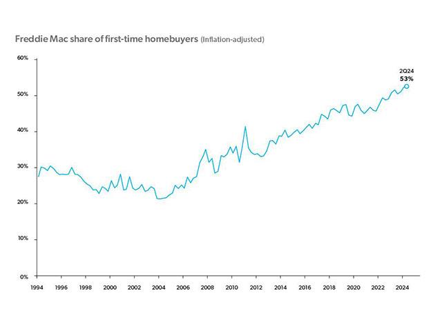
Spotlight | October 18, 2024
First-Time Homebuyer Activity
First-time homebuyers are increasingly driving demand in the housing market. However, they face headwinds in affordability, supply and overall economic conditions. More